A Jelly Website is perfect for non-profits

 Nest

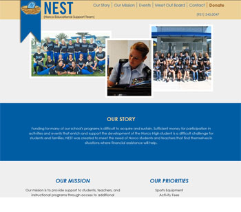
The board of directors of NEST needed a website to promote their non-profit and community events.  Of course we stepped right up because we thought a Jelly Website would be perfect.  NEST didn’t have a lot of content but they were growing and wanted the website to grow with them.  Due to the seamless additional of links, content and photos their website will grow with them and it won’t look like a “band-aided” template.  Check out their great cause at www.supportnest.net


Patients are raving about new Heart Healthy Program and the website!

 gunn

Landing pages are a great way to separate a new or key service you provide in your practice.  Dr. Gunn wanted a website page that gave so more than traditional pages but didn’t want a cluttered feel.  A Jelly Website was perfect due it’s expanded menu functionality.  We matched his brand and packed the website with all the great details about his program – The result is a beautiful, informative website that his patients can easily navigate.  Visit his website at www.gethearthealthytoday.com

Patient education takes top priority for this Indianapolis dentist.

Kirtley

Dr. Kirtley knows the power of keeping his patients up to date with the latest services his practice offers.  He is a leader for general dentistry, implants and cosmetic dentistry, including tooth whitening, in his area. We created separate landing pages for all three services so he could focus on a particular dental service and his patients could learn about that procedure in more detail.  View Dr. Kirtley’s services

www.generaldentistryindianapolis.com, www.dentalimplantsinindianapolis.com,

www.porcelainveneersindianapolis.com

Additional websites are great for building content online

George2

Dr. George wanted to expand his presence on the Internet by featuring the Pinhole Surgical Technique.  This additional page will not only make Dr. George look current and relevant online but boost his content building efforts.  The more content he builds online the more he will be rewarded with better positioning by browsers like Google.  Check out his new landing page at www.pinholesurgicaltechniquephiladelphia.com

New start up business will look like a Million Bucks online!

raven


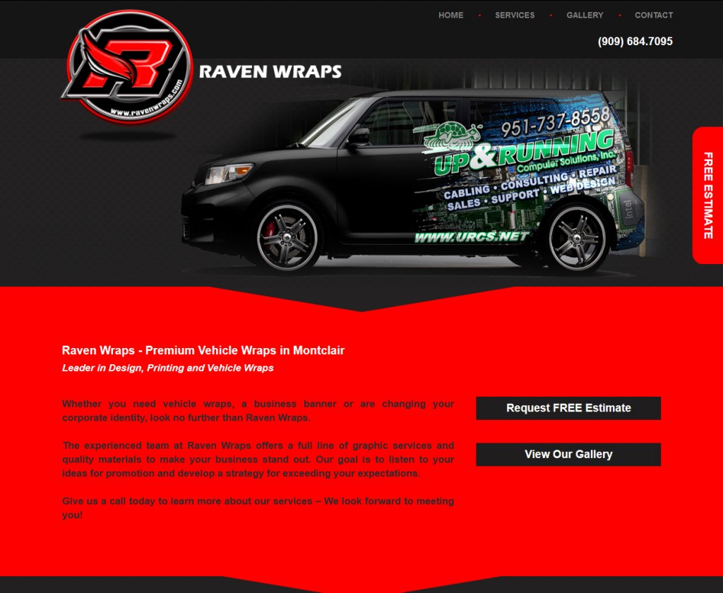
Raven Wraps came to us in need of a new corporate website. Because they were a new company they didn’t have very many client samples to work with.  We used our resources to enhance their design and the result is a truly professional look.  They are excited to expand on their services and galleries and we are more than happy to make these additions.  Check out their website at www.ravenwraps.com