What Were The Popular Web Design Trends of 2016? | Corona, CA

478033279

The world of web design is always changing, and even over the span of a year web design can begin integrating interesting new trends and patterns that develop how websites should be presented. The year of 2016 has been quite popular, as today web designers are trying to constantly step their game of to connect with potential viewers and create the best websites. The following are few of the most popular trends of 2016:

Mobiles Features- you may have been able to get away with not having any mobile features five years ago, however now a large portion of your traffic will come from smartphones. This is why designers are catering to that more and more. One common method is to design your website to be mobile-friendly. Designers are enable more scrolling on homepages rather than having to click through your website.

Design and Color- This has been a year for innovate design when it comes to color schemes, typography, logos and more.  Companies are constantly trying to find way to appeal to their target audience, and to stand out you must be bold. Whether you take a minimalist approach or through vibrant colors, you have to get your target audience interested in your website.

Visuals- The use of visual content should be an obvious trend, as it’s very important. While there is text, it is now expected to have visual content to draw your viewer in. In many cases it’s better to find an image or video to help draw your viewers in. Many visitors will get hooked in by the visual content that your website displays.

Interaction- Customer interaction in extremely important. You should let your customers feel like they have control and decisive power that will keep them engaged. For instance, you could offer online support or features for visitors to “share” to social media.

For more information regarding web design, contact Jelly Websites in Corona, CA at 951-371-9327 or visit www.jellywebsites.com for additional information.

Jelly Websites proudly serves Corona, Riverside, Chino, Ontario, Tustin, Yorba Linda, Fullerton and all surrounding areas.

How to Improve Your Website | Corona, CA

478033279

Unlike wine, websites don’t age gracefully over time. In fact, if you haven’t updated your website in a few years, it may be time for you to consider updating your website for the sake of your business. The world of website design is constantly evolving and if you want your business to stay relevant, you best keep up with the latest web design trends.

Like any business owner with a website, you know how aggravating it can be to keep your website up to date. You want your website to be used to generate new customers, as well as to help your existing ones. If your website isn’t generating traffic at all, it may be because it’s time for you to improve your website. The following includes a few tips that will be useful to improve your overall website:

  • Be mobile-friendly. Several people use smart phones or tablets to browse the internet, so your site must be “mobile friendly”. For a website to be “mobile friendly”, it should be able to optimize to smartphones and tablets. Whether you have a responsive website or a separate mobile site, you never want your visitors to have to zoom in and out to read the content or navigate your website. Keep in mind that your font style and size should be easy to read. In addition, all of the buttons must be big enough to click without having to zoom in. When websites are up to date and “mobile friendly” visitors tend to spend more time on the site.
  • First impressions count. Keep in mind that your homepage is essentially the face of your company to online world, the first thing a visitor usually lands on and you want to make a positive impression. According to research, it only takes eight seconds for a visitor to make a judgement, so your homepage must be attractive, provide useful information, and of course, include eye-pleasing graphics. (Don’t use any cheesy stock photos.) Another key to improving your website is to make sure that you use compelling headlines with keyword-related content. Remember visitors aren’t the only ones on your website; search engines crawl your website as well.
  • Great Call-To-Action. It’s smart to place a Call-to-Action on every page. You want potential customers to come across these. You can place a “Schedule Appointment”, “Sign Up For Emails” or “Follow Us” icons in prominent places on your homepage and throughout your website to gain customers. Say an interested visitor is reading about your company’s services or products and right below there’s a “Schedule Appointment” or “Sign Up For Emails” button for them to click. This gives you more opportunities to gain customers.
  • Include personality. It's far more important for your visitors to read what other customers have to say about your products or services, rather than speaking for yourself. Several people go looking for reviews before calling to schedule any kind of appointment or purchasing a product. This makes it very important to incorporate testimonials into your website. A testimonial should be visible on your homepage and should link to another page with all your testimonials listed there. When it comes you the “About Us” section on your website, explain who you are as a person, not just as professional. Add personal touches, like your hobbies outside work, how many children or pets you have or where you graduated from.

If you’re interested in improving your website, contact Jelly Websites in Corona, CA at 951-371-9327 to schedule a free consultation today. Or visit www.jellywebsites.com for additional information.

Proudly serving Corona, Riverside, Chino, Ontario, Anaheim, Irvine, Tustin, Yorba Linda, Fullerton and all surrounding areas.

What Makes a Wonderful Website Homepage? | Corona, CA

506932373Many people seem to judge a book by its cover, and it’s no different when visiting your website's homepage. Keep in mind that your homepage is essentially the face of your company, and it’s typically the first page a visitor lands on. There are several aspects that make an interesting homepage, and it typically all comes down to the basics. If you want to make sure that you have an enticing homepage, take a look at the following web tips:

  • Provide clear answers. When a visitor lands on your website, it’s generally because they’re seeking something of interest or because they’re looking for some sort of service. A great website homepage should provide clears answers like, who you are, what you do, and what you can do for the visitor. This assures your visitor that they know they’re in the correct place. Most people often scan a page for bulleted items and/or call-to-actions.
  • Provide a Call-to-Action. If you want to encourage visitors to “dig a little deeper” into your website, you must incorporate a Call-to-Action, also commonly called a CTA. Your Call-to-Action should lead visitors to take the next logical step. For example; “Learn More,” “Free Trial,” or “Buy Now” are great calls to actions you can provide. Your website may need a secondary Call-to-Action or a different placements.
  • Provide a clean design. You may think you have the best web design out there with all flashy photos and music, but in reality this is most likely slowing your website down, while also distracting your visitors from obtaining the information they were searching for in the first place. Be sure to effectively utilize the white space, color scheme, and font accordingly.
  • Provide periodic web changes. When you update your services or products on your website, it can draw customers back, creating loyal customers. Some of the best website homepages change to reflect the visitor’s needs, wants or questions.
  • Provide value. If you want to ensure that your visitors stick around your website, provide them with value while also sharing what makes your business stand out from your competitors. Be sure that you use original content and credible information to help set yourself apart from your competition.

If you’re interested in obtaining a wonderful website with a breathtaking homepage that draws visitors, contact Jelly Websites in Corona, CA at 951-371-9327 today! Or visit www.jellywebsites.com for additional information regarding website design.

Proudly serving Corona, Riverside, Chino, Ontario, Irvine, Tustin, Yorba Linda, Fullerton and all surrounding areas.

The Pros and Cons of Responsive Design vs. Mobile Websites

smart phone

Did you know most internet browsing is done on smartphones? So you have website, it better be “mobile-friendly”, as they are great attribute to provide and are also vital to the success of your website. Mobile optimization is important for several reasons, such as search engine optimization, usability and speed optimization.

There are two routes you can take when choosing the best web design for your business, responsive web design and a separate mobile website. For those of you that don’t know exactly what the difference is, here’s a good explanation:

Responsive Web Design and Mobile Websites

A responsive design site is a website that will change in width and layout according to the size of the screen and type of device you are viewing it on. For example, is you were to read a website on your phone is portrait mode, and the decided to rotate it into landscape mode, the design of the website would change and adapt to the way you are viewing it. Mobile websites on the other hand, are a dedicated version of the website in smaller version. This type of mobile website is usually needs to be maintained separately and have a different set of code base.

Responsive Web Design

Pros:

  • Easier to manage
  • One site for several devices
  • Recommended by Google
  • Lower in Cost
  • Simple SEO

Cons:

  • Some older devices don’t support responsive web techniques
  • Unoptimized for mobile and slow loading times

Mobiles Websites

Pros:

  • Optimized for a mobile user
  • Improved usability
  • Quick to implement

Cons:

  • Multiple domain names
  • Twice the maintenance
  • More SEO work
  • Cross platform sharing can be tricky

Before you choose the option best suits your company, you should first establish the purpose of your website. Be sure that you keep your target audience and business goals in mind. Also keep in mind that no matter which type of web design you choose, it will be viewed on a mobile devices.

If you are interested in acquiring more information regarding web design, contact Jelly Websites in Corona, CA at 951-371-9327 or visit our website at www.jellywebsites.com for more information.

Proudly serving Corona, Riverside, Chino, Ontario, Anaheim, Tustin, Yorba Linda, Fullerton, and all surrounding areas.

3 Online Marketing Myths

506932373

Many people have heard and also believed some of the most absurd and unrealistic myths about online marketing. Often times these myths are detrimental to ones business because they are based on false principles that are supposed to lead to online success.

This typically happens to be people that either lack preparation skills for what is required to build an online marketing strategy or they misunderstand how to prioritize the resources they have to improve their online appearance. In such cases, these business that do the latter go under before they even have the chance to thrive.

Several online marketing myths and misconceptions are still very persuasive to some. There may even be some vendors or services that market online marketing myths and target those that don’t know any better. So if you’ve come looking for online marketing myths to bust, you come to the right place. The following list includes three common online marketing myths:

Myth #1: People will buy your product just because it’s cheaper than your competitor. Just because your prices for your product or services are lesser in price does not mean that it will result in word-of-mouth, purchases or market share. People need to know you exist before any of that happens. Excepting orders to roll in because just because your product is lesser in rice than your largest competitor is silly. You must create awareness using online marketing practices such as SEO, creating a social platform, etc.

Myth #2: I must get as many visitors to my website as possible. Yeah getting traffic is great and all, but it doesn’t always provide the results you may be expecting. There’s a big difference between getting traffic and getting the right type of traffic. To get gain the right kind of traffic you must focus on a specific target group and niche, this is a great way to provide your company with a larger number of leads. When sells are lows, a few clicks onto your page is not going to solve the problem.

Myth #3: When my website finished, my work will be done. Sure you may have developed a beautiful website with all of the latest web design trends, but that doesn’t mean that your work is over with. In fact, it’s quite the opposite because this is when the real work comes into play. You must stay on top of your business by consistently creating and promoting great content and come up with new ways to engage with your followers or target audience. Again, this is where you must think outside of the box and use other sources such as social media platforms, blogging, etc.

If you would like to learn more about online marketing or would like help building a website of your own, contact Jelly Websites in Corona, CA at 951-371-9327 or visit www.jellywebsites.com for additional information regarding online marketing.

Jelly Websites proudly serves Corona, Riverside, Chino, Ontario, Tustin, Yorba Linda, Fullerton and all surrounding areas.

5 Tips to Get Your Website Noticed

Man on website Do have an online business? Have you had a tough time getting your website noticed? As nice as the quote “If you build it, they will come” sounds, it doesn’t work well in the case of building a website. Unfortunately, it takes a lot more effort than just building a beautiful website for it to drive traffic.

It takes time to build an audience, and it also takes certain knowledge to accomplish the goal of driving traffic to your website in the first place. The following includes a list of five tips and tactics to help your website getting noticed:

Content Marketing- Content is key. One of the very best ways to get your website noticed is by getting your content seen by as many people as possible. Meaning that you should try to get on as many websites as possible. You want this content to drive visitors to your website, so be sure that the articles or blogs you produce are high-quality.

Social Media- You can use social media to help promote your website and get your business noticed. Social media platforms like Facebook, LinkedIn and Twitter are an ideal way to publicize your website or blogs. You can start by making business profiles on the largest social networks, such as Facebook and Twitter, to help get your business noticed. It’s important that you stay consistent with post or tweets and encourage sharing to help generate traffic to your website.

Professional Look- Incorporating flashy photos, background music and walls of text isn’t going to drive visitors to your website. As a matter of fact, it will do the exact opposite. It’s been said that it only takes 8 seconds for a visitors to judge a website, so don’t waste your time with trying to go all out. Simplicity is key, so be sure to take the time to make sure your website visually pleasing and organized.

Partner Up- Find someone to partner up with that has similar content and exchange links. It’s essentially a cross promotion. You can also design an eye-catching banner to place on your partner’s site, and in return you can do the same for them. You can also produce a free WordPress page and include a link back to your website in the footer.

Start Blogging- It’s no mystery that search engines love fresh content. If you’re not updating your website regularly, the search engine crawlers won’t visit it very often. Unless you can update your website every day or every few days, the easiest way to produce fresh content is to start blogging or have “news” page. You can use this to talk about your latest projects or to provide tips, among much more. Write about things that will attract your target audience.

Getting your website noticed won’t happen overnight, but some time and effort you can make it happen. If you’d like to get your website noticed, contact Jelly Websites in Corona, CA at 951-371-9327 today or visit our website at www.jellywebsites.com to view our portfolio.

Proudly serving Corona, Riverside, Chino, Ontario, Irvine, Tustin, Yorba Linda, Fullerton and all surrounding areas.

5 Signs Your Web Design Style is Outdated

web designI’m sure we’ve all come across a business buildings that look like they haven’t been worked on in decades due to chipping paint or sad landscaping. As you notice them though, you walk or drive right past them eyeing other establishments.
The same applies to your website, considering it’s essentially your business’s storefront. Having an exceptional website will build your credibility and also help establish your presence in your industry, while having an outdated website do the exact opposite.

Potential customers associate an outdated website with outdated or poor quality products or services, which is why I’ve compiled a list of the top 5 sign your website design is outdated:

  • Outdated Fonts and Graphic Elements- For those who don’t know, icons, images and graphic content play a big part in defining ones websites design style. Good news is, this is quite an easy update. Most web designers are moving towards flat design, vector-based elements, clean design for better usability on little screens and simple communication.
  • Irrelevant Content- Many websites tend to acquire all sorts of articles and features over time. However, even with good information architecture, a great web designer and regular maintenance, your website can lose all of its original organization it once had. You can improve this problem by redesign, but you must first have a strategic plan to separate the relevant information from the junk.
  • Not Mobile Friendly- Your website should be compatible and scale to fit on all screen sizes. You can wither with a completely separate mobile website or choose to have a responsive website. A responsive website will adapt to any device, no matter what size screen.
  • Built with Flash- While Flash is a great tool to create rich multimedia experiences, it isn’t compatible to IOS. This means that a website built with Flash will not work on an iPad or iPhone, making Flash websites a bad idea. Thankfully, there’s the help of HTLM and CSS3 that work on all modern browsers, while also giving better search results in Google.
  • To Many Images- While having photos, video and sound files can be an asset, however, it can drive your visitors to click that back button if your website is overwhelmed with graphic elements. Additional problems with graphics include things such as outdated logos that appear funny on a newer display screen, images instead of text in menu line or on buttons and using images in the footer rather than text.

If you feel your website design is out of date and needs some sprucing up or a whole new look, contact Jelly Websites in Corona, CA at 951-371-9327 or visit www.jellywebsites.com for additional information regarding web design.

Jelly Websites proudly serves Corona, Riverside, Chino, Ontario, Tustin, Yorba Linda, Fullerton and all surrounding areas.

Wicked Pilates | Custom Website Design Corona, CA

wicked

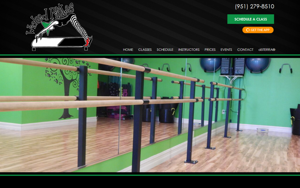
Jelly Websites is extremely excited to announce yet another launch of a new website, Wicked Pilates! This beautiful and seamless custom website delivers a great first impression for online viewers. Our talented team here at Jelly Websites created this interactive website to be simple, yet elegant attracting visitors to dig a little deeper. The website showcases the classes, schedules etc. and provides easy access to the content.

Our team here at Jelly Websites is extremely committed to building websites that best convey your brand image, your passion, your commitment and your expertise. Before launching your website we learn the key components that make you stand out from your competition, research your competitor and research your keywords to understand what will be effective for your online marketing. This is why our websites serve as an effective marketing tool to reach current and potential customers, saving you and your staff valuable time.

Click here to view Wicked Pilates beautiful custom website.

If you’re ready to take your company to the next level with a seamless custom website, contact Jelly Websites in Corona, CA at 951-371-9327 or learn more by visit our website at www.jellywebsites.com.

Proudly serving Corona, Riverside, Chino, Ontario, Tustin, Yorba Linda, Fullerton and all surrounding areas.


R & R Landscape| Website Design Corona, CA

r and r

Jelly Websites is proud to announce the launch of one of our newest websites R & R Landscape. Our talented team of web designers here at Jelly Websites built this seamless website to be fresh and informative without bombarding the viewer’s senses. This beautiful single page website provides the perfect amount of information, while leaving viewers interested in attaining additional information.

We here at Jelly Websites are dedicated to getting to know you so that our team can build websites that reflect your company’s personal style and attracts viewers online. By also adding search engine optimization tags we can also help you gain new customers. Due to our 16 years in website design and development, we have the resources to do all of the hard work of getting you noticed saving your valuable time.

Click here to view R & R Landscape’s full website

If you’re ready to take your company to the next level with a beautiful single page website, contact Jelly Websites in Corona, CA at 951-371-9327 or visit our website at www.jellywebsites.com for additional information.

Proudly serving Corona, Riverside, Chino, Ontario, Tustin, Yorba Linda, Fullerton and all surrounding areas.


8 Tips for Creating a Great Website Footer

506932373

Often time’s people tend to forget about the importance of their websites footer. The footer of your website is one of the most important locations on your webpage. Although this area of your website may not be designed impressively, your visitors look for the footer in search of important information. It’s vital that you don’t neglect your footer when planning for a web design project.

So, what elements should you incorporate in your footer? How can you go about keeping your footer organized and seamless without over designing? The following tips include ways to create a great footer without it being obtrusive:

  1. Keep It Clean- When dealing with lots of information, you must make the design simple. This way it’s easy for your visitors to find the information they’re seeking and extract it efficiently as they need. Make sure your design has purpose, fresh content and clean spacing.
  2. Provide Links- Two of the most important links on your website are “Contact Us” and “About Us”. When visitors land on your webpage they typically want to know more about your company and its members. So, your footer must be linked to these pages to provide the best service.
  3. Basic Contact Info- Besides including “Contact Us” into your footer, you can add your contact information, like your physical address, emails address and phone number. Try including an icon that offers auto dial, emailing or a site map with your location.
  4. Arrange by Importance- The footer should contain some sort of hierarchy of the elements within the area. Your information should be divided in columns or rows and arranged by relevant important information like contact information, social media, links, etc.
  5. Include Copyright Notice- Including a Copyright Notice is extremely important to your security and can save you from facing many problems. You can copyright your work by including a copyright notice. This statement includes the copyright symbol, name of the copyright owner, and the year it was created.
  6. Include Call To Action- All of the best website design include a call to action, and many businesses find that including one last call to action in your footer can be the extra nudge your visitors need to sign up for newsletters, subscribe to blogs, or to send an email requesting a quote. Make sure to keep your footers call to action brief and straight to-the-point.
  7. Contrast and Readability- Your footer is typically small in size and much of your info is kept in that small block. That being said, you must make sure to balance the background and contrast of the text to make it readable. Also, color, brightness and contrast must be taken into consideration.
  8. Use Graphic Elements- Many times footers are just block of text. Add logos or graphic elements for added visual interest, but be careful not to overdo the small space with too many elements. So rather than spelling out “Follow me on Facebook/Twitter” include icons for these outlets.

Your footer is an extremely important part of your web design. Make sure you include the right mix of information, design elements and usability to get the most out of your footer in every web design project.

If you’re ready to take your company to the next level with a beautiful website, call Jelly Websites in Corona, CA at 951-371-9327 or visit our website at www.jellywebsites.com to learn about the services we offer.

Proudly serving Corona, Riverside, Chino, Ontario, Anaheim, Irvine, Tustin, Yorba Linda, Fullerton and all surrounding areas.